COLLABORATION
Feedback 1
Psychographics
In the earliest stage of brand development and exploration, the target audience was considered by a professor to be slightly narrow, turning into a demographic. More specifically, it needed more focus on audience actions and their connection to the chosen “need.” The first iteration was defined as “newer parents who require an outlet from their employment but can include their family.” Self-assessment also determined that this audience was split between needs of affiliation and diversion. This feedback and self-assessment of the audience behavior was valuable in determining a more accurate target audience that resonates with the brand's benefit. Though it was reworked/reworded over a few months, the target audience was ultimately determined as “active parents who want to grow their relationships with their families and others.” This made the audience open to any age, profession, and family size, focusing specifically on their lifestyle choices and need of the brand benefit, “affiliation.”
"Newer parents who require an outlet from their employment but can include their family"
"Parents who want to spend more time with their families"
"Active parents who want to grow their relationships with their families and others"
Feedback 2
Brand Name
The first iteration of the brand name was tested for feedback from peers and a professor. This revealed that despite its connection to Las Vegas history, the ideas associated with the name “Dynamite” were the opposite of the brand direction. Because the audience was focused on the family dynamic and the brand benefit selected was affiliation, dynamite was considered limiting in brand communication, or otherwise ineffective. It was recognized that Dynamite did relate to the energetic atmosphere of the brand, but other suggestions like “mob” may serve the brand better. This was particularly valuable feedback since it helped determine the direction of the brand in the early stages, preventing lost time from a redevelopment process. Additionally, it helped evaluate the effectiveness of other name ideas through further research. Because of an existing intent to utilize a brand name with a connection to Vegas culture/history without associating with its negative connotations, it led to the choice of “Aces”, eventually “Flying Aces”, which was representative of positive achievement and related to a sense of affiliation.
-
Lightning
-
Mob [Bosses]
-
Thunderbirds
-
Melody
-
Supersonics
-
Dynamite
-
Neon
-
Syndicate
-
Squadron
-
Cavalry
-
Armada
DYNAMITE

Feedback 3
Militaristic Camaraderie
Patriotism &
Camaraderie
Because the sense of patriotism in the military was the original intention, a term more relatable for civilians, the theme was redefined as “patriotism & camaraderie” to reflect all backgrounds of the audience that may share this sense of country pride. Furthermore, it helped justify the color palette of red, white, and blue because of their associations with Western patriotism (Adams, 2017). Overall, this feedback was foundational to developing the proud, welcoming, and inclusive personality of the brand through the look and feel.
Theme
A professor suggested that the first chosen theme of militaristic camaraderie, brand traits, and the audience were not clearly connecting. Because the audience is family-oriented and the need is affiliation, the sense of militaristic camaraderie appeared too official or ordering. This was contrary to the welcoming atmosphere needed to provide affiliation for families. Because it was determined the idea of military as a theme was confusing and inconsistent with the direction of the brand at this point, this feedback was considered to rework the theme.

Feedback 4
Taglines/Slogans
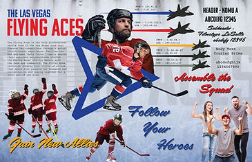
When building the brand traits, a professor declared that among three provided tagline ideas that one in particular stood out among the rest because of its direction towards the brand benefit of affiliation. While each was created to use aviation terminology and referencing terms that allude to teamwork and groups, the tagline “Assemble the Squad” was determined most appropriate for the audience. This feedback with others helped focus the brand on ensuring its inclusivity for all ages and using the correct tone. When displaying the tagline (determined later as a slogan) through the first version of the vision board, this feedback drove the development of other calls to action like “Follow Your Heroes” and “Gain New Allies” that truly focused in on the brand’s encouraging voice and team atmosphere.
Assemble the Squad!
Who's Your Wingman?
Find Your Unit.

Feedback 5
Font Selection
Komu A font - for Headers


Team USA Jerseys, using Agency Gothic
An initial reaction from a professor suggested that the Heading font choice was more reminiscent of the Soviet Union rather than communicating USA in the way the rest of the brand elements intend to go. While certainly noted considering the font author’s description, suggesting its relation to Czechoslovakian billboards of the 20th century, the font choice was not changed because of its similarities to both team USA’s hockey team font (Agency Gothic) and American military aircraft labels (Filípek, 2024). Therefore, the primary font selection was made with the confidence it could still communicate the brand effectively.

Military print font
Self Assessment 6
Font Selection
The original secondary font, for use as a sub-header, was considered not effective enough with the intended brand direction and other font choices. It contained the bold nature of the existing header font, and the serif style of the paragraph font. Though the overall selection of the fonts caused a need for three very different typefaces, it’s reconsideration led to the choice of Filmotype LaSalle to create a notable differentiation between the fonts and their uses (Saltz, 2014). While serving this function, the font is also reminiscent of aircraft nose-art paintings and helped create the connection between new and old generations. It’s stylization also matched the energetic feeling of the brand and the taglines it conveyed in the vision board.


Feedback 7
Vision Board
A professor considered most of the first vision board effective towards the needs and goals of the brand for its look, feel, voice, and tone. However, what was determined straying from this was a singular image of a lone, young hockey player. It was suggested that even a single photo of an individual, especially alongside other photographs of groups, hindered the brand communication of teamwork, family, and affiliation. Therefore, the use of singular persons throughout further brand development was minimal in nature, and this image was removed in the vision board revision. When singular persons are used, they may be graphically manipulated to have multiples of themselves present.

Feedback 8
Logo Development
After opinions from peers over the first 30+ logo drafts, a professor questioned that the brand needed to determine what kind of era of aviation history the logo needed to convey to sufficiently support other brand goals and traits. The logo development explored many different icons and airplanes that were modern and retro. This ultimately drove consideration of what imagery and icons for aviation are most recognizable for the audience and relevant to modern day.
The logo development was then narrowed into iconic airplanes and symbols like patches and badges because of their historical and modern relevance (Crawford, 2023; U.S. Army, n.d.). Because of the feedback and further research, logo development narrowed down to two logos that are recognizable symbols; the patch logo used a modern jet because it could connect new generations with old through the modern jet and “old-school” typographic choices.

Feedback 9
Logo Choice
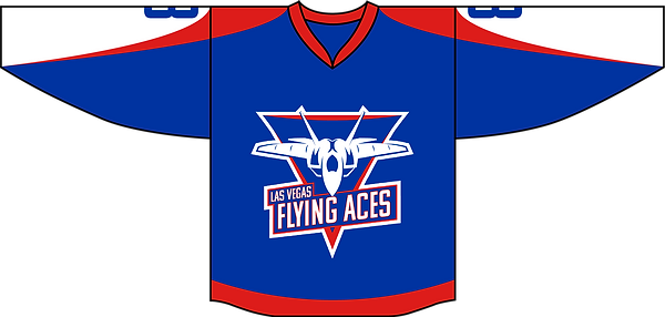
Peers reviewed the final two logo options, each put into single- and multi-color, revealing that the patch-styled logo was more effective. More specifically, it acts in the same way that the military squadrons do with their various squadron logos, displayed as patches (suggested as a possible brand asset), and was stylized like competitors of the hockey market. The other logo option was suggested to be too minimal for the particular brand market, and corporate in style. This feedback was heavily considered when selecting which logo to use, and further refine. The feedback helped to determine the overall manipulation and usage of the logo in graphical ways as well; the patch logo was considered more versatile and easier to reference in this way because of the dynamic qualities to its lines and shapes. Therefore, this logo was chosen and used because of its symbolic value and ability to be referenced across the brand experience.


Logo inspiration

Final Logo choice
Feedback 10
Media Assets
In the first development phase of media assets, the brand stationery and social media were determined to be ineffectively communicating the brand’s hockey team aspect by a professor. Because there were only references to aviation via the logo and wing-like graphical lines, the element of hockey was considerably gone, besides the existence of hockey jerseys to pair with them. Therefore, the development of a tagline that incorporated references to both aviation and hockey was key to solving this problem. Across each print piece and social media page, the tagline “Ace the Ice” was placed with a hockey stick icon, unifying each media asset while answering the question of what kind of brand it is.


Feedback 11
Logo Animation
A professor reviewed the first version of the brand logo animation. The feedback given suggested that the introductory element, a spinning “V”, was ineffective of relating to the brand personality and not the best element from the logo to manipulate alone. Furthermore, the flashing words next to it were moving too fast, and the overall animation was not clear enough to convey its hockey relevance as well.
Version 2
Version 1
Though some sound effects like hockey tape ripping or a slapshot were used, the animation was determined in hindsight as too busy to notice. Therefore, this feedback and assessment drove the sonic branding to be central to the logo’s animation. The logo was introduced by ripping like the tape and flashed with the sound of a hockey skate, ending with a hockey horn and cheers. The feedback drove the animation to be straight to the point and on the nose of being a hockey team while subtly including suggestions of its personality.
Feedback 12
Swag/Merchandise
While the brand merchandise items generally did well with communicating the brand, the patches and stickers, when standing alone, faced the problem of no clear identifier associating it with hockey. Though this feedback from a professor was perfectly valid, the intent of the patches were to be versatile in placement on other merchandise items that had permanently incorporated the developed tagline icon. However, patches and stickers were determined to be appealing because of their strong versatile nature, appearing in other places like laptops, bags, and keychains. Therefore, the brand included the secondary logo with the tagline for stickers and patches to have an option that embraces a present hockey reference.


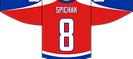
Self Assessment 13
Uniforms
Though the first draft appeared effective enough by a professor, a self-assessment of the uniforms determined they created a knockout of basketball logos while not conveying the intended idea of winged sleeves effectively. Changes were made to follow the similar graphic choices of other media assets. While using the same color palette, the jerseys maintained a solid color, and the curved lines were restricted to the shoulders and arms, where minimal patches and items would appear. This change ultimately was determined as the right decision because of its relation to other media pieces that used curved lines in the brand messaging.


Feedback 14
Version 1
Commercial (15-sec)
A professor reviewed the brand’s developed 15-second commercial, determining that it solved the questions of the brand as a hockey team and conveyed its traits. For further improvement, however, the commercial needed more elements of the sonic branding used in the logo animation to ensure a seamless connection with other brand pieces. This feedback was valuable and immediately incorporated because of the determined value of sonic branding for a brand rollout. This creates a unified association between ice hockey sound effects with the aviation iconography from the logo, and ultimately re-reviewed by the professor as effective and professional.
Version 2
References
Adams, S., & Helfand, J. (2017). The designer’s dictionary of color. Abrams.
Crawford, S. (2023, September 4). Symbolism in logos: Striking a balance for global appeal. Inkbot
Design. https://inkbotdesign.com/symbolism-in-logos/
Filípek, J. (2024). Komu from DizajnDesign. Komu | Adobe Fonts.
https://fonts.adobe.com/fonts/komu#about-section
Saltz, I. (2014, October 17). Combining typefaces based on stylistic contrasts - typography: Choosing
and combining typefaces video tutorial: Linkedin learning, formerly Lynda.com. LinkedIn. https://www.linkedin.com/learning/typography-choosing-and-combining-typefaces/combining-typefaces-based-on-stylistic-contrasts?resume=false&u=50813145
U.S. Army. (n.d.). U.S. Army Badges Information. https://veteranmedals.army.mil/home/us-
army-medals-award-badges-ribbon-and-attachments-information/us-army-badges-information