SOLVING PROBLEMS
The Client Problem
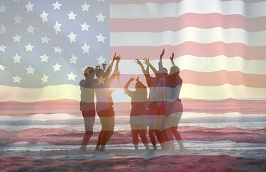
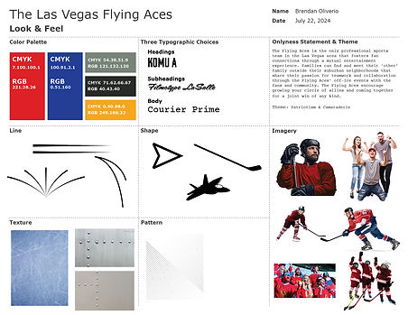
The client wants to effectively instill community pride in Las Vegas while maximizing brand loyalty and sales through an ECHL team.
Solution 1 - The Voice & Tone
Determining a Brand Personality
Two main ideas for the brand first needed to be established – a promised benefit, and an audience to whom it is being promised.
Benefit
The benefit was decided first: affiliation because of a need for community and social relationships in Las Vegas. This benefit serves as the backbone to narrowing the target audience that would most likely require such a need.
Audience
Iteration 1: The first iteration of target audience was defined as “newer parents who require an outlet from their employment but can include their family.” This assumed and focused on three ideas about the target audience: they are a young family, likely in the service industry, desire quality family time. It also leans towards an audience with a need of diversion, and possibly stimulation from a possibly monotonous lifestyle. Because McNamee (2024) communicates that nearly two-thirds of the Las Vegas workforce is in service industry, this audience may desire an escape from the work environment, which would include their family and a social experience different than the casino culture. It is assumed that they would prefer a new way to associate with their city. However, the need of affiliation is less clear given the random specificity of this audience.
Iteration 2: The audience was refined to “Parents who want to spend more time with and grow their families.” This focuses on the fact that parents want to develop their personal and social relationships. Because it broadens the demographic of parents and focuses on their relationship needs, this iteration is more successful and fits within the brand goal to build community pride.
Iteration 3 – Final Solution: The audience was finally refined to “active parents who want to grow their relationships with their families and others.” This encompasses the idea that the targeted families are more willing to socialize publicly, serving to the brand’s selling point of providing a sense of community. Because Thompson’s (2024) exploration of the family dynamics in Las Vegas reveals a priority to strengthen relationships through various activities, the brand intends to appeal to those parents’ priorities and bind it with their sense of community with Las Vegas.
Brand Traits
Iteration 1: Because the brand pursues parental and family relationships, the personality focuses on traits that encompass desirable values for parents to instill in their children. Though the brand intends to bring different families together as well, the traits focus on making closer, comfortable relationships like that of a parent and their child(ren). These traits also served as the basis for the first theme iteration.
The Brand IS
Confident
Brotherly
Masculine
Encouraging
The Brand ISN'T
Poised
Neighborly
Abrasive
Demanding
The Brand IS
Collaborative
Encouraging
Dynamic
Optimistic
The Brand ISN'T
Enforcing
Demanding
Aggressive
Naive
Iteration 2 – Final Solution: Based upon the integration of a military-styled theme with the family-oriented social dynamic of the brand, the traits were revised to focus on welcoming values, centered around teamwork and aspiration. Furthermore, these terms were chosen to mimic military leadership principles that incorporate an approachable tone. The brand adopts an embracing atmosphere in order to serve towards its goal to create a sense of community and pride.
Brand Theme
The brand theme was first established as “militaristic camaraderie” to integrate the military historical connections of Las Vegas (and the general region) with community pride. However, it was determined that this theme would lead the brand to an unapproachable personality, and one that the average person unaffiliated with the U.S. military’s culture may not understand. In order to remain relatable to the target audience, the theme was revised as “patriotism & camaraderie.” The idea of patriotism is more general and comprehensible compared to military pride, and it easily captures the sense of unity that the client seeks to create in its audience. Though the theme changed, it still was rooted in a military referencing brand due to relevant Las Vegas history. This theme and the brand traits help establish a point of reference for brand cohesion.

Determine Brand Archetype
Brand archetypes help to personify the overall demeanor, voice, and tone that the client desires. Like Felton’s (2013) definitions of every kind of subconscious need for audiences, the archetypes appeal to audiences in the same way as an imaginable character. This client has a goal of creating a sense of community in the Las Vegas area; therefore, the sense of connection across and within families is mostly associated with the Everyman archetype. This archetype gets on the level of the simplest person, with characteristics like humility, authenticity, and friendliness (Cass, 2019). Because the brand theme has American patriotic and military premises, there exists features derived from the Hero archetype. However, these features will always relate in some way back to the benefit of community and the personality of the Everyman.
Determining the Brand Name
Iteration 1: In the earliest stages of brand development, a spread of options was created to tie in the brand with the Las Vegas culture, history, and even weather. It was clear at the start of development that the client wanted an engaging brand, so terms were related to some type of action and energy. From the list, the selection made was Dynamite until further exploration of its effectiveness to match the intended audience and brand benefit.
Iteration 2: Upon further inspection of the idea of Dynamite, it was determined that the name alone suggested explosions and separation, opposite to the intended goal of bringing the audience together. Supersonics was thus considered as a new option because of the relevant aviation history and sense of camaraderie associated with the military.
Iteration 3: Upon discovery of the former Supersonics basketball team in Seattle, now moved and known as Thunder, the brand name was once again reevaluated in order to maintain differentiation to other major sports teams. With a goal to remain within the aviation motif, it was renamed the Las Vegas Aces. Due to its double meaning as a playing card and pilot achievement, and further research revealing that Las Vegas hosts a WNBA team called the Aces, it was retitled the Las Vegas Flying Aces. Its specificity made it a clearer differentiation, and it plays into the relatable personalities of the historical figures who claim this title.
-
Lightning
-
Mob [Bosses]
-
Thunderbirds
-
Melody
-
Supersonics
-
Dynamite
-
Neon
-
Syndicate
-
Squadron
-
Cavalry
-
Armada
Final Choice: The Flying Aces
Because of the indelible mark Nellis Air Force Base has on both American history and Las Vegas itself, the title Flying Aces helps to relate the audience with something generally positive about the city and breaks away from any negative connotations. As one of the largest employers in the Las Vegas area, a large affiliation already exists with the community (Nellis AFB, 2023). Further study about historical pilots who earned “ace” status reveals that many of their personalities and backgrounds are relatable to the average
American, whether they were farm workers, boy scouts, or missionaries (Fraser, 2016). It is also helpful that over the course of history, achievement of ace status could be split up by contributors to target scores, reinforcing the teamwork element of the brand (Smithsonian, 2008). Therefore, the renaming of the brand to Flying Aces will be successful because it touches into an existing, widespread affiliation, reflects the values of the brand, and it attends to the goal of the client to create community and pride in Las Vegas.
Determining Brand Slogans & Tagline
Slogans
Following the choices to move in a military style, the tagline potential was defined by its terminology. The choices were focused on using terms that reference allies or a group size to relate back to the client need. Among the three possibilities determined (right), the direction of the brand followed “Assemble the Squad” because it serves as a call to action for the audience to include others.
Assemble the Squad became a slogan with others like “Follow Your Heroes” and “Gain New Allies” because the generally represent the brand personality and serve as small highlights of the brand meaning.
-
Find Your Unit.
-
Assemble The Squad.
-
Who's Your Wingman?
Tagline
-
Ace the Ice
-
Flight to Win
-
Hockey with Altitude
While the brand continued development for look & feel and media expression, an official tagline was not selected until further testing. The concepts of hockey and aviation through a patriotic theme were not maintaining an obvious link as originally intended when creating media assets. At this point, the use of an effective tagline would come into play to help unify the brand expression. A few options were considered, shown on the left.
The goal was to cross hockey and aviation terms in one phrase while speaking to the target audience. Ace the Ice was selected because it ties to the brand name and acts as a rallying call to action. Swartz (2006) suggests that taglines influence the behavior of the audience by summing up all that the brand stands for, which in the client’s case is a positive sense of community and pride. The idea of “acing” means to achieve at high levels and is an idea all people can relate to and take pride in. Though the tagline may change or visually disappear as the brand ages, it appears in every medium and always includes a hockey stick icon to seal its brand connection.

Solution 2 - The Look & Feel
Determining Visual Elements
The overall ideas of "look & feel" were investigated before combining them into a full vision board that would demonstrate a hopeful brand look.
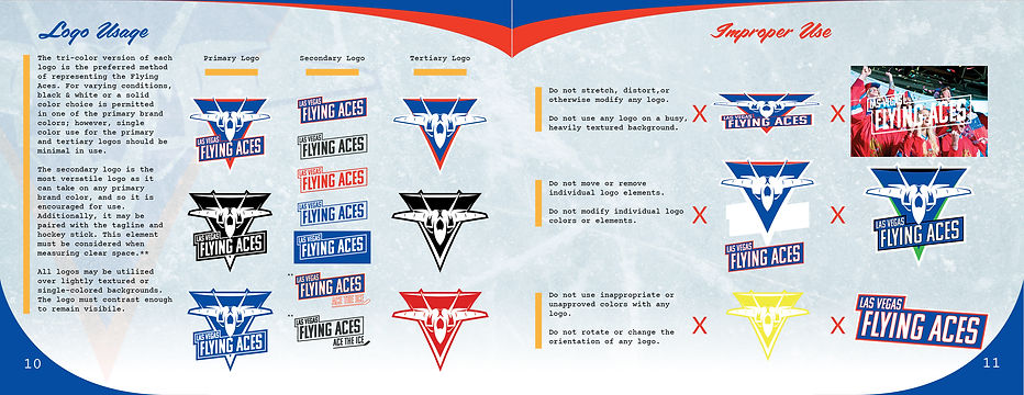
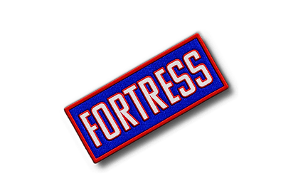
Color Palette
The color palette of the Flying Aces includes the primaries of red (white) and blue as the foundation of the brand to clearly speak to the patriotic themes of unity. The combination of these two primary colors reflects the client’s intentions and brand ideas of collaboration and patriotism. These are supported by Ghost, Gunship, and Gold. The greys were added to induce a sense of maturity to the brand and a connection to metallic textures associated with aviation. The Gold serves as an accent against these to embrace an uplifting dynamic for the younger crowd that would attend with their parents.
Typography
Each of the typographic choices were chosen because of their resemblance to the mid-20th century typefaces in American military. Because the subheading and body typefaces were too similar in style (both serif), the subheading was changed to a heavily stylized font to create a greater contrast from both the heading and body fonts as recommended by Saltz (2014).
Imagery, Line, and Shape
The first draft of a vision board included a general sense of movement to be included within the brand, from line qualities and shapes. The line quality was decidedly limiting because of the established brand value of dynamics, so another curved line suggestion was included in revision. The lines will reflect the ideas of direction and movement that are associated with both aviation and ice hockey while also helping create separation and hierarchy throughout the brand experience (Kinnel, 2023). The starting imagery was mostly inspirational for the eventual logo development. However, imagery of fan “groupies” and multiple hockey players at once was especially focused long-term to focus on the client’s goal of community. The Vision board imagery was revised to focus on this kind of imagery and help visualize the audience.
Texture
The first phase of brand vision combined the possible textures found in hockey with the sheet metal that build aircraft. This was ultimately reduced to simply two textures – hockey ice and sheet metal. The ice with all its grooves and cuts creates an obvious connection to the nature of the sport, but symbolize the dynamic qualities of the brand and aviation itself, referring to the brand name. The sheet metal directly represents the textures of airplanes, but their bolted-together panels are figurative of the teamwork aspect of the brand, a team which can only work successfully when all pieces are combined.

Look & Feel version 1
Look & Feel version 2 (Final)
Creating a Vision Board
The first vision board was created based on the hopeful look & feel that would visualize and reinforce brand attributes. It was ultimately inspirational to the development of the logo. Following a deep exploration of logo development (next section) and further research, the vision board was recreated to better reflect the brand’s dynamic quality as well as the focus on community and togetherness.

Vision Board BEFORE logo development
Vision Board AFTER logo development
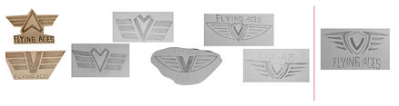
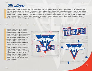
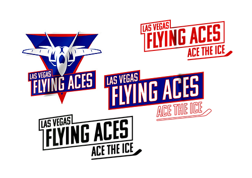
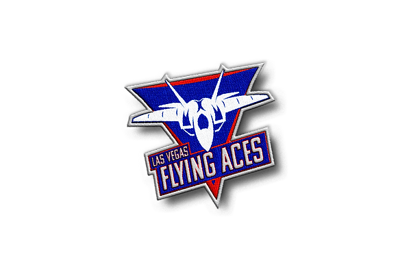
Developing a Logo
In the sketching phase, the intention was to create a simple design that included both the brand name and a symbolic icon that could briefly represent the brand and its theme, and accomplish the goal of the client. A wide variety of logo sketches, and styles, were created inspired by the market competitors as well as iconography found within military aviation, such as unit logos and pilot wings.

<-- After evaluation of each logo’s effectiveness, the options were reduced to six ideas for further ideation.
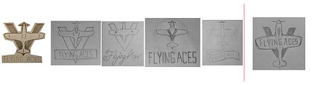
Logo 1
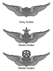
The first logo option developed as a result of an attempt to combine two sketches that shared similar shape and concepts: the Vegas “V” and a Delta symbol both as a centerpiece for pilot wings. The overall line quality was manipulated to move towards a dynamic style the brand was turning into, while remaining simple. Deemed one of the more effective choices, it particularly represents the sense of community the client is looking for because there exists this common symbol for all pilots and other related qualifications in the military and civilian sectors alike (U.S. Army, n.d.).
Logo 2

The logo design combines the cursive painted lettering of 20th-century aircraft with the dynamic movement of airplanes themselves. Each iteration moved to more accented textual thickness and a faster sense of speed. Though the wordmark matched the eventual icon of a fighter jet, communication of affiliation specifically was not delivered as well.
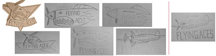
Logo 3
This third design evolution emphasizes the alignment between the "V" shape and the jet’s tail fins, creating a cohesive symbol of speed and power. Spacing out the elements formed a triangle, turning the "V" into a wider angle to represent Mach speed, with the name trailing in a curved sonic blast cone. By removing unnecessary elements like the banner, the design shifts focus to brand values of teamwork, excellence, and pride.

Logo 4

The initials "L" and "V" evolved into a winged "V" for a balanced look, reminiscent of a pilot’s badge while highlighting teamwork with six sticks, representing the number of players on the ice. A side-view puck holds the team’s name, blending hockey and aviation themes. This logo plays particular attention to the client’s goal, the brand’s sport, and the brand values.
Logo 5
The fifth logo development attempted to address the incorporation of cohesion, connecting each element—the Vegas "V," airplane, and title text—into a unified whole. By positioning the title on the plane itself and overlapping it with a bold "V" in the background, the design gains balance and direct relevance. The northward facing plane symbolizes direction and growth, capturing the hopeful momentum of the brand community.
Logo 6
The original design featured a WWII-style aircraft shark face blasting out of a triangular frame, with the team’s name below. To streamline the design, iterations explored simplifying the shark mouth and integrating the title with the nose art, creating a cleaner look. The design evolved to display the entire aircraft with a simplified shark face, floating alongside the team’s name. Overall, it was determined too difficult to simplify the design that would eventually use a two- or threefold color scheme, though the shark face was symbolic for achieved pilots in a particular period.
Following the iterative process for the 6 logos, each was evaluated again.
Three logos were chosen for further development and integration of brand color.

Following another evolution, the pilot badge and engaged fighter jet were determined the most effective as representative of the brand because they easily connect to existing symbols, which is key to creating a memorable logo and brand (Crawford, 2023). Both developed into semblances of iconic aviator uniform badges and patches, which each are representative of pride and membership, and reaches the emotional goal of the client.
The Badge logo took a minimalist route to become a versatile logo, though it earned a more corporate feel. The engaged fighter jet played with a base shape similar to market competitors, and it developed into a logo that could be separated into two pieces, enhancing the brand versatility.
Logo Refinement and Final
The final adjustments incorporated research and notes from the entire development process to create a versatile logo that represents the brand values and personality. While also inspired by the success of competitors, the logo’s ability to represent the brand in any environment and size, Airey’s (2014) idea of “thinking small,” is key to creating an effective logo, and drove the style of its final version and guide for use.
Solution 3 - The Media Expression
Creating Media Assets
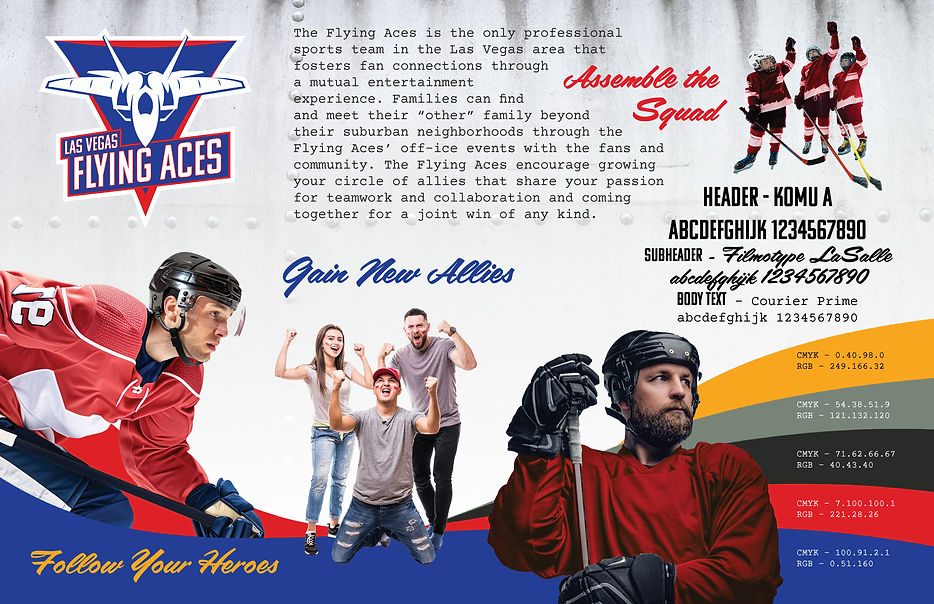
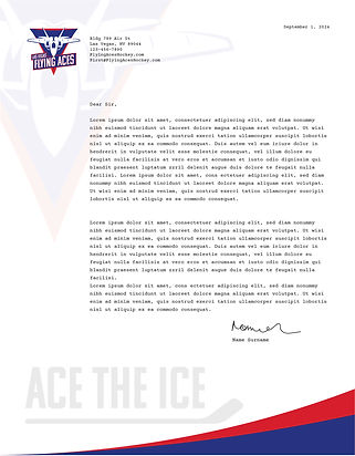
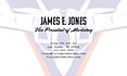
Letterhead Package
The letterhead pieces were created to express the style and personality of the brand even in more formal occasions. Each piece should represent the qualities of the brand and feel uniform with every other visual medium, reinforcing the idea of affiliation for the client.


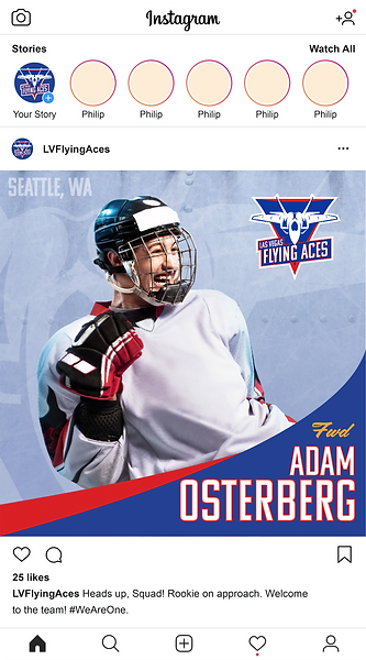
Social Media
Social media profiles were created across different forms of media access and platforms to show the uniformity they must have across the board. For each respective piece, posts will be adjusted for their aspect ratios while maintaining the same brand styles. To create a sense of unity, each uses the brand tagline to reinforce the sense of pride and community for the audience.


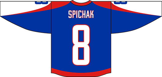
Uniform Jerseys
The jersey designs were guided by the ECHL guidelines and their uniform provider, Athletic Knit, who allow customization of uniforms. With this freedom, the brand utilized the dynamic element of the brand on the jerseys to reinforce the expression and message, and unite with other media pieces. In a case study about the development of the Seattle NHL team, it was discovered that showing consistent brand messaging with or without a logo was key to ensuring recognition (Davies, 2022). Because the Flying Aces is a new brand, these elements are shown across all pieces of media as dual- or tri-color ribbons and curves.


Swag and Merchandise

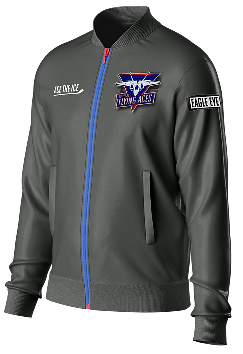


The Flying Aces takes on classic forms of merchandise and spins it in the theme of the brand to help drive revenue for the client and enhance the audience's sense of affiliation. Each piece of swag is a way for fans to feel associated with the brand. The individualized patches contain callsigns, terms that mix aviator and hockey references, and allow the audience members to have a desired place and role within their social groups and families while still feeling part of the team.
Fans with Fever (2020) highlights the most popular purchased merchandise from the MLB as ball caps and t-shirts because of their durability and clear visual presentation of the wearer's affiliation. This guided the basis for creating wearable swag for the Flying Aces. Furthermore, the relevance of patches and badges as explained by Alex (2023) inspired the customization element of these classic pieces. With modern military gear often using Velcro for easy patch attachment, the patches themselves become a collectible and customizable feature for fans and enhances other merchandise, driving sales for the client.


Animated Logo
The animated logo is a visual representation of brand attributes, focusing on the energetic experience for the audience through sonic branding, and serving as a reminder of the brand association to both ice hockey and aviation. Because the primary audience is parents, it intends to appeal more to this audience versus their children.
Brand Commercial
While maintaining its versatile nature, the brand introduces itself with a commercial that utilizes sonic branding and memorable storytelling to communicate the values of the Flying Aces. In this example, the ideas of teamwork, movement, and pride are communicated through its dynamic style and imagery. This commercial serves as a way for the target audience to identify the brand and associate the name with ice hockey and brand attributes.
References
Alex, A. (2023, June 26). US Marine Corps patches: A comprehensive guide to their history
and significance. News Military. https://newsmilitary.com/us-marine-corps-patches-a-comprehensive-guide-to-their-history-and-significance/
Airey, D. (2014, August). Logo Design Love, annotated and expanded edition, Second edition.
O’ReillyOnline Learning. https://learning.oreilly.com/library/view/logo-design-love/9780133812589/ch08.html#ch08lev1sec1
Cass, J. (2019, December 18). Brand Archetypes - Ultimate Guide with examples. JUST.
https://justcreative.com/brand-archetypes-ultimate-guide
Crawford, S. (2023, September 4). Symbolism in logos: Striking a balance for global appeal. Inkbot
Design. https://inkbotdesign.com/symbolism-in-logos/
Davies, M., Armstrong, C., & Blaszka, M. (2022). No name, no logo, no problem?: Examining early fan
connections to NHL Seattle. Sport Management Review, 25(3), 406–427. https://doi-org.oclc.fullsail.edu/10.1080/14413523.2021.1937894
Fans with The Fever: Which Licensed Sports Merchandise Are Sports Lovers Buying. (2020). Souvenirs,
Gifts, & Novelties, 59(3), 128–132. https://search-ebscohost-com.oclc.fullsail.edu/login.aspx?direct=true&db=bth&AN=142780389&site=ehost-live
Felton, G. (2013). Advertising: Concept and copy. W.W. Norton & Company.
https://bookshelf.vitalsource.com/reader/books/9780393733921
Fraser, C. (2016, April 15). Top 10 U.S. fighter aces of World War II: War history online. warhistoryonline.
https://www.warhistoryonline.com/featured/top-10-u-s-fighter-aces-word-war-ii.html
Kinnel, K. (2023, March 14). Lines in graphic design explained: A comprehensive guide (2024).
Eksposure. https://www.eksposure.com/lines-in-graphic-design/
McNamee, G. L. (2024, July 7). Administration and Society. Encyclopædia Britannica.
https://www.britannica.com/place/Las-Vegas-Nevada/Administration-and-society
Nellis Air Force Base. (2023). Home. https://www.nellis.af.mil/About/Fact-
Sheets/Display/Article/284174/nellis-air-force-base/
Saltz, I. (2014, October 17). Combining typefaces based on stylistic contrasts - typography: Choosing
and combining typefaces video tutorial: Linkedin learning, formerly Lynda.com. LinkedIn. https://www.linkedin.com/learning/typography-choosing-and-combining-typefaces/combining-typefaces-based-on-stylistic-contrasts?resume=false&u=50813145
Smithsonian. (2008, April 6). What does it take to become an “ace”? Smithsonian.com.
https://www.smithsonianmag.com/air-space-magazine/what-does-it-take-to-become-an-ace-35385936/
Swartz, E. (2006). Tagline guru: Wag the Tagline. Tagline Guru | Wag the Tagline.
https://www.taglineguru.com/wag_the_tagline.html
Thompson, E. (2024, June 16). “Fathers enjoy fatherhood”: Dads spending more time with their kids.
Las Vegas Review Journal. https://www.reviewjournal.com/local/local-las-vegas/fathers-enjoy-fatherhood-dads-spending-more-time-with-their-kids-3069569/
U.S. Army. (n.d.). U.S. Army Badges Information. https://veteranmedals.army.mil/home/us-
army-medals-award-badges-ribbon-and-attachments-information/us-army-badges-information